Creative Design Case Studies
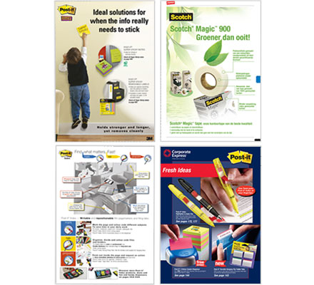
Challenge: Develop space ads for major retail office supply catalogs that 1) introduce as new products, and 2) reflect product strengths of 3M Post-It Super Sticky and Index products, to set apart from competitive products by playing-up the unique features and benefits.
Solution: Highlight unique product applications for consumers, as well as provide in-depth product information, driving shoppers to specifically to those sku offerings in the catalog.
Results: Sales increased and client expanded channels to include series of banner ads as well as increased number of in-catalog space ads for other 3M Office Supply products.
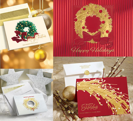
Challenge: Expand 2011 line of Business-to-Business Holiday Greeting Cards for Deluxe’s Small Business Services Division. The line had not been updated for 2 years. Challenge was to leverage traditional print techniques and holiday subject matter, but in fresh, contemporary new designs.
Solution: Leveraging our vast design network, we developed over 300 new design concepts for client to choose from and slot 150 new card designs in compressed timeframe.
Card designs satisfied a wide range of print techniques, from traditional heavy foil and emboss, to 3D and print-on-demand.
Results: New card designs along with freshened catalog and website presentations have resulted in increased sales across all channels, beating YTD forecasts by 12%.
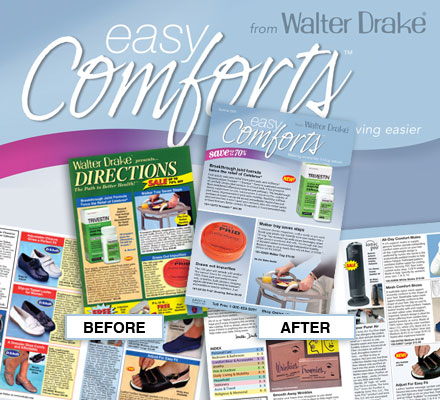
Challenge: Revise the long-standing Directions catalog brand to express the essence of the product/service offering and increase sales volume.
Solution: Conducted quantitative research with Directions customers to establish baseline understanding of consumers as well as qualitative research via focus groups to provide insight into the mindset and behavior of shoppers in this category. Developed new name (Easy Comforts) that more effectively expresses the brand essence and product offering. Catalog redesign includes inviting new cover design, new opening spread and new product spreads that are cleaner and easier to shop.
Results: Redesigned catalog pulled 6% higher than any previous mailing and continues to be a winning control.
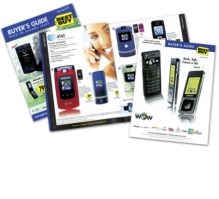
Challenge: Update bi-monthly cell phone catalog, used as an in-store educational tool for sales staff and customers, to be more visually appealing, better organized and easier to use.
Solution: GEM surveyed sales associates and competitors, and studied the current catalog from the inside out. Design recommendations were developed based on reducing the overall visual noise, greater emphasis on featured products, attention to photography style and consistency, and an enhanced color-coded table of contents system.
Results: The updated catalogs were released to Best Buy stores across the nation in May 2007. Beginning in October 2007, the catalog was increased to monthly distribution.
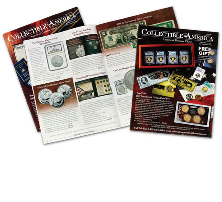
Challenge: Develop identity and implement tactics to support the repositioning of The Washington Mint catalog, now named Collectible America.
Solution: By understanding the target audience and product mix, GEM developed a strategy that showcased Collectible Americas growing portfolio of products.
Results: A new logo and tagline were developed to communicate the company’s offerings and essence of the brand. The front cover was redesigned to include a beauty shot of intriguing products, in order to capture the target’s attention. Finally, icons were designed to assist the customer in identifying unique products and their attributes. All tactics were extremely well received, and are still in use today.
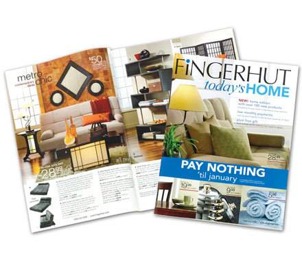
Challenge: Develop an appealing identity and format for a new catalog featuring home furnishings and accessories that would differentiate this book from clients general merchandise catalogs while enhancing the Fingerhut brand.
Solution: GEM designed a format to feature dramatic room settings that presented coordinated decorating solutions for clients customers. New photography provided a consistent yet exciting presentation for themed spreads. Outline photography was used to pace the book and add additional interest. The cover masthead clearly identified the clients brand while establishing the new title.
Results: Catalog test pulled sufficiently to establish this as a regularly mailed specialty book to select customers.
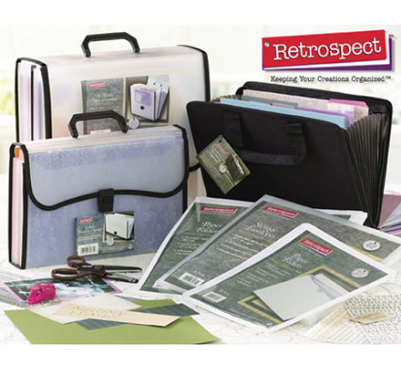
Challenge: Develop marketing materials to support the launch of a new product line in the scrap-booking genre.
Solution: GEM created an identity for the new line of products based on the company’s overall brand value proposition, the attributes of the product line, and the competitive landscape, and applied the brand messaging consistently to all support materials.
Results: The new Retrospect brand had a consistent look and feel across all marketing materials related to the new product line. Sales response to the new product line was extremely positive.
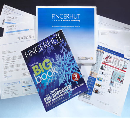
Challenge: Define a new brand strategy for the relaunch of the Fingerhut company that would leverage the legacy of Fingerhut while positioning them for rapid growth to new target segments. Apply new branding to all market channels – catalog, direct mail, web.
Solution: GEM leveraged the knowledge of Fingerhut’s experienced leadership team and customer research to develop graphics, brand standards, key messaging and value statements.
Results: The Fingerhut brand is presented consistently across all marketing channels. Catalog sales and web traffic has increased 500% in the 4 years since the new brand standards were introduced.
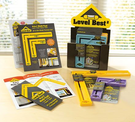
Challenge: Create a brand identity and all supporting materials for the launch of a revolutionary new 4-in-1 tool, combining a level, plumb, square and ruler.
Solution: In an extremely tight timeframe, GEM developed a product name – Level Best2 – as well as logo design, package design, website, trade show exhibit, trade ads, sell sheets and brochures to launch the new tool.
Results: The tool was introduced at the May 2008 National Hardware Trade Show in the New Inventors pavilion. Response was overwhelming with the product named to the Top 5 New Products list. Major home improvement and hardware retailers have also placed the Level Best products in their stores.
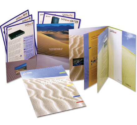
Challenge: Create integrated collateral for product marketing and shareholder communications.
Solution: GEM recommended a new identity for the SANbox brand and a unique creative approach for all collateral playing off “sand” representing seemingly infinite bits of ever-moving data.
Results: Ancor Communications established itself as a leading player in the SAN networking field and was later acquired by Qlogic Corp.
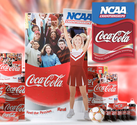
Challenge: Leverage partnership with NCAA to drive incremental display of Coca-Cola products and increase sales.
Solution: GEM created comprehensive regional/local promotional marketing materials that embodied the shared brand attributes of Coca-Cola and the NCAA Championships, including the design of a joint program logo combining two strong brands. Also developed customizable promotions to activate local markets for any NCAA National Championship event or winning team. Produced a user-friendly CD (the “GamePlan”) about the NCAA partnership.
Results: Program greatly exceeded clients expectations and continues in use.
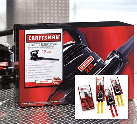
Challenge: Craftsman is a Sears flagship brand with consistently high and positive awareness levels. With 300+ manufacturers supplying more than 8,000 Craftsman products, packaging inconsistency and brand integrity became a major issue for Sears.
Solution: GEM worked closely with the lead design agency for Sears to interpret package design and photography objectives across a spectrum of packaging structures. GEM works directly with dozens of Craftsman manufacturers to interpret and apply the new Craftsman design, executing all design, copy, production, photography and quality control services.
Results: New dress code for Craftsman continues to be successfully extended to new products on a regular basis with positive sales results.
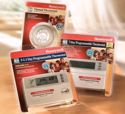
Challenge: Redesign entire line of Honeywell Thermostats with appropriate information for contractors and DIYers.
Solution: GEM used market research to understand the target and redesigned packaging and POS to better leverage the brand and communicate on shelf. Research included visual audit of existing packaging, shelf settings and communications for Honeywell products and competitors, and consumer focus groups. Established a communications hierarchy for the packaging, including a graphic architecture and segmentation of the product group. Designed 40 total packages, 10 sell sheets, 40 shipper labels and 2 display headers.
Results: Retail sales increased double digits year over year.
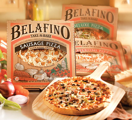
Challenge: Develop a packaging solution to alleviate structural failures resulting in inconsistent product presentation and low perceived quality of their deli pizzas.
Solution: GEM designed a new package structure and graphics that improved stability and product presentation and created a high-end look and feel for this line of premium deli pizzas utilizing cost-effective corrugated materials and printing.
Results: The Belafino brand and associated design overwhelmingly outscored the deli brand in consumer testing.
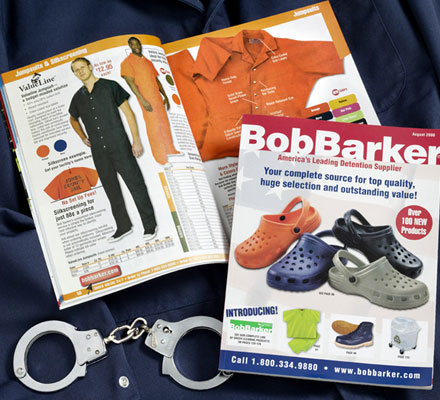
Challenge: America’s leading detention facility supplier had recently acquired a major competitor and needed to seamlessly integrate both company’s product offerings, while enhancing the overall catalog shopping experience, featuring new and exclusive products. Objective was to increase overall sales volume and develop new customers, while not alienating existing core customers.
Solution: GEM developed a new design with a more cohesive and logical flow, while maintaining the general catalog structure familiar to long-time customers. Exclusive Bob Barker products, as well new products, were highlighted more effectively in the updated design.
Results: Sales significantly increased. Customers praised the new catalog.
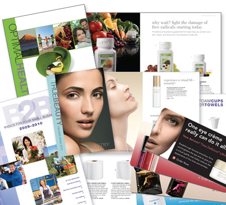
Challenge: Step-in as general creative services resource, replacing and supplementing internal staff during a reorganization. Work with multiple internal Amway constituents – brand, marketing, and product leaders – across multiple marketing channels, print and digital, keeping a consistent brand voice across all campaigns.
Solution: GEM provided dedicated creative and account staff including on-site at Amway, immersed in Amway brand standards, processes and product specifics. We created an array of marketing components from email blasts and banner ads to sell sheets and catalogs for multiple Amway-owned brands including Nutrilite.
Results: All design work was delivered with elevated creativity, with optimized performance results across all channels.


